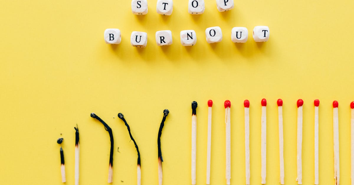
12 Unexpected Ways Office Colors Supercharge Your Concentration (And How to Use Them)
If you’re wondering how to turn your office into a concentration powerhouse, the secret is in the paint. Color isn’t just decoration - it’s a subtle yet powerful tool that can calm, energize, or invigorate the brain. By choosing the right hues and pairing them with lighting and design, you can create workspaces that keep your mind sharp, your mood steady, and your productivity high. Green Desks, Sharper Minds: The Beginner’s Guid...
1. Blue - The Focus Fuel
- Scientific link between cool blues and reduced heart rate, leading to steadier attention spans.Blue is often called the “calming color” because studies show it can lower heart rate and blood pressure, creating a physiological state conducive to sustained attention. Think of a quiet library: the muted blue walls reduce sensory overload, allowing your brain to focus on the task at hand. In a work setting, a gentle navy backdrop can help employees maintain steady concentration during deep-work sessions, while lighter sky-blue areas encourage relaxed collaboration without overstimulating the nervous system.
- Best shades for different zones: navy for deep-work rooms, sky-blue for collaborative spaces.Deep work demands an environment that minimizes distractions. Navy, a dark cool blue, signals seriousness and can help your brain stay on a single track. On the other hand, sky-blue’s lighter tone is inviting for group discussions and brainstorming, offering a gentle reminder that the space is open and communicative. The key is matching the mood of the activity with the intensity of the blue.
- How pairing blue walls with natural daylight amplifies its calming effect.Natural light enhances the serenity of blue. The reflective quality of daylight on a blue surface creates a soft glow that keeps the space from feeling too closed in. Imagine a sunny office with blue walls; the light penetrates, reduces shadows, and reinforces the calm atmosphere. This synergy helps keep your mind from drifting into fatigue while still allowing creativity to flow.
- Pitfalls of over-bluing: when too much cool can make a team feel sluggish.While blue can be a focus booster, too much of it - especially in bright, harsh shades - can backfire. Over-bluing a space can make employees feel numb or emotionally distant, reducing their enthusiasm. Think of a wintery landscape that’s too bleak: it may feel cold. A balanced palette with small pops of warmer color or natural elements can keep the blue from turning into a mental lull.
Common Mistake: Mixing saturated blues with heavy grey lighting can create an overly sterile environment that dampens motivation. Use warm amber fixtures instead to soften the ambiance.
2. Red - Energy-Boost or Distraction?
- Red’s ability to raise alertness and why a splash can jump-start short bursts of concentration.Red stimulates the sympathetic nervous system, raising heart rate and increasing adrenaline. A small splash of red - like a strip of paint or a decorative wall - can serve as a quick catalyst for alertness, making it ideal for short, high-intensity tasks. Think of a red traffic light: it demands attention and signals that action is required.
- Strategic placement: accent walls in break-areas versus avoiding red in primary workstations.Positioning red in break zones, such as coffee stations or rest corners, can encourage quick mental recharge without overwhelming the main workspace. In contrast, embedding red in a primary desk area may cause overstimulation and lead to anxiety or distraction. Use red as a cue for transition rather than constant background.
- Balancing intensity: using muted reds or rose tones to keep energy high without overwhelm.Muted reds, like brick or rose, provide warmth without the shock of bright scarlet. These softer tones elevate mood while maintaining a sense of calm, much like a cozy fireplace that sparks conversation but doesn’t ignite a wildfire. They are perfect for creative hubs where a gentle nudge of enthusiasm is needed.
- Research-backed warning: prolonged exposure to bright red can increase stress hormones.Extended exposure to vivid red has been linked to increased cortisol, the body’s stress hormone. Prolonged eye contact with bright red can lead to mental fatigue, especially for tasks that require sustained precision. Keep the exposure short and targeted, and consider a complementary neutral backdrop to balance the energy.
Common Mistake: Painting an entire office in bright red can cause an adrenaline spike that leaves employees exhausted by the end of the day. Use red sparingly. Why Bright Offices Fail: The Counterintuitive S...
3. Green - Nature’s Quiet Power-Up
- How green mimics outdoor scenery, lowering cortisol and supporting sustained focus.Green is the most natural color for humans; it reflects the calm of forests and parks. Studies indicate that green environments can lower cortisol, the stress hormone, and improve attention. Imagine a green office as a digital oasis, reducing mental strain and encouraging long, uninterrupted work sessions.
- Optimal hues: sage, moss, and teal for open-plan desks and quiet pods.Sage provides a subtle, unobtrusive backdrop that promotes concentration. Mossy greens offer warmth without saturation, making them ideal for high-density areas. Teal, with a slight blue undertone, blends focus with creativity - perfect for hybrid meeting rooms where deep work meets discussion.
- Integrating biophilic elements (plants, views) with green paint for a double-dose of calm.Pairing green walls with real plants or large window views amplifies the restorative effect. The combination of visual and tactile nature cues triggers the brain’s “nature reflex,” providing a mental break that restores attention. Think of a green wall with a vertical garden; it’s both aesthetic and functional.
- Avoiding “muddy” greens that can make a space feel stagnant.Too dark or murky greens can feel claustrophobic and lead to a sense of stagnation. Keep the green palette bright enough to reflect light and avoid shades that resemble damp soil or leaf mold. A vibrant, fresh green feels like a breath of fresh air.
Common Mistake: Using the same green tone for both walls and furnishings can create visual monotony. Introduce texture or contrasting accents to keep the eye engaged.
4. Yellow - The Creative Spark
- Yellow’s role in stimulating dopamine, sparking idea generation and mental agility.Yellow is the sun in paint form - its bright hue triggers dopamine release, boosting mood and alertness. This makes it an excellent color for spaces that require rapid idea flow, such as brainstorming rooms or creative labs. It’s like a mental caffeine boost that’s safe and sustainable.
- Ideal applications: accent strips, meeting-room doors, or collaborative zones.Instead of painting an entire room yellow, use accent strips along the ceiling or a single door to inject energy. The subtle pop of yellow signals a place for lively discussion without overwhelming the senses.
- Choosing the right brightness: pastel yellows for subtle lift vs neon for high-energy bursts.Pastel yellows (like lemon chiffon) gently brighten a space, fostering calm confidence. Neon yellow, on the other hand, can energize fast-paced environments but may strain eyes if overused. Think of neon as a lightning bolt - effective in a flash, but not for prolonged use.
- Managing glare: matte finishes and strategic lighting to prevent eye strain.Glossy yellow paint reflects light and can create glare, especially under bright LED fixtures. Matte finishes absorb light, reducing strain. Position lights to bounce off ceilings rather than directly onto walls to keep the yellow uplifting without blinding.
Common Mistake: Painting an entire conference room yellow can turn the space into a “solar flare” that overstimulates participants. Stick to accents or trim. Color-Coded Calendars: How Chromatic Scheduling...
5. Neutral & Gray - The Balanced Canvas
- Why a neutral base creates visual breathing room, letting focal colors shine.Neutrals like off-white, beige, or light gray act as a soft backdrop that lets other colors pop. They prevent visual fatigue by providing a calm canvas, much like a blank page where words can stand out. This foundation ensures that vibrant accents don’t clash or overwhelm the eyes.
- Best grayscale tones for large open areas to avoid visual fatigue.Light grays (e.g., #d3d3d3) reflect natural light and keep large spaces airy. Dark grays, while sophisticated, can absorb light and make the room feel cramped. Using a gradient from light to medium gray across a wall can also create depth without strain.
- Combining warm grays with wood textures to add subtle comfort without distraction.Warm grays paired with wood or metal accents introduce tactile warmth. This blend keeps the environment grounded and relatable, akin to a cozy living room that’s still functional for work.
- Using texture (matte vs satin) to add depth while keeping the mind uncluttered.Matte finishes reduce glare, making them ideal for areas with high ambient light. Satin provides a slight sheen that can add a touch of elegance without becoming reflective. Choose the finish based on lighting and desired mood.
Common Mistake: Overuse of bright white can feel too clinical, while deep charcoal can feel too dark. Opt for mid-tone neutrals to maintain balance.
6. Accent Strategies - Smart Pops of Color for Peak Focus
- The 70-30 rule: 70% neutral backdrop, 30% purposeful accent to guide attention.Applying the 70-30 rule means that the majority of the space stays calm, while 30% is dedicated to a vibrant accent that directs the eye. Picture a neutral wall with a 6-inch wide red stripe - this subtle cue can direct flow without overstimulation.
- Color zoning: assigning specific hues to distinct functional zones (e.g., blue for deep work, yellow for brainstorming).By mapping colors to tasks, employees can intuitively understand the purpose of each zone. Blue zones signal concentration, green zones promote relaxation, and yellow zones invite creativity. This visual language reduces cognitive load when navigating the office.
- Dynamic elements: movable color panels,
Read Also: The Hidden ROI of a Furry Co‑Worker: How Pet Ownership Cuts Stress for Urban Professionals